

By the MJC design team, Orlando. Updated November 2026.
Short answer: Two-tone kitchen cabinets work when one color clearly leads and the second supports it. The safest combinations are a darker island with lighter perimeter cabinets, darker lowers with light uppers, or a wood tone paired with one painted color. Test real samples in your own kitchen, because Florida light changes how colors read.
What are the main two-tone cabinet combinations?
Two-tone kitchens follow a few proven patterns. Each one puts the second color in a place where it makes visual sense, so the contrast looks planned instead of accidental.
- Contrasting island. The perimeter cabinets share one color and the island gets another. This is the easiest two-tone to get right, because the island already reads as a separate piece of furniture.
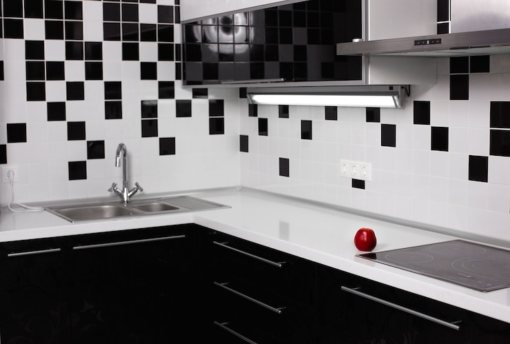
- Dark base, light uppers. Lower cabinets in a deeper color ground the room, and lighter upper cabinets keep the walls bright. It works well in kitchens with low ceilings or few windows.
- Wood and paint. A wood tone on the island, the lowers or a set of open shelves, paired with a painted color elsewhere. Wood adds warmth that a two-paint combination can lack.
- Tall wall contrast. A run of tall pantry and oven cabinets in one color, with the rest of the kitchen in another. It turns the storage wall into a feature.
How do you balance two cabinet colors?
One color has to lead. When two colors split the kitchen evenly, the eye does not know where to rest and the room feels busy. Many designers use the old 60-30-10 rule of thumb from interior design: about 60 percent of the visible surfaces in the main color, 30 percent in the secondary color and 10 percent in an accent, such as hardware or lighting. It is a guide, not a law, but it keeps the contrast in proportion.
The cabinets also share the room with the countertop, the backsplash and the floor. Pick the two cabinet colors with those surfaces in hand. A busy granite slab pairs better with quieter cabinet colors. A plain countertop leaves room for a bolder island. Hardware can tie the two colors together, for example brass that warms up a navy island and a white perimeter at the same time.
Undertones matter more than the color names. A warm white next to a cool gray can look dirty. A green with yellow undertones next to a gray with blue undertones can fight. Put the samples side by side before you decide, and check them against the floor.
Which two-tone color pairs hold up over time?
| Pair | Feel | Works with | Watch out for |
|---|---|---|---|
| Navy island, soft white perimeter | Classic, crisp | Brass or nickel hardware, light granite, wood floors | Pure bright white can look cold next to navy, so a soft white is safer |
| Muted green lowers, warm white uppers | Calm, natural | Wood tones, warm metals, natural stone | Very saturated greens date faster than muted ones |
| Wood-tone island, painted perimeter | Warm, relaxed | Almost any paint color and most countertops | Match the wood to the floor or contrast it clearly, never almost match |
| Charcoal lowers, light wood uppers or shelves | Modern, grounded | Light countertops, black or stainless hardware | Dark lowers show dust and scuffs near the floor |
| Two shades of the same family, like light and deeper greige | Subtle, quiet | Busy stone, patterned backsplash | Too close and the difference looks like a mistake |
How does Florida light change cabinet colors?
Central Florida kitchens get strong daylight, and many open to a lanai through wide sliding glass doors. That light shifts color through the day. A gray that looks neutral at noon can look blue in the morning and warm in the late afternoon. West-facing kitchens get intense orange light before sunset, which warms every color in the room.
Artificial light changes colors too. Warm white bulbs make whites look creamy and push grays toward beige. Cool white bulbs make whites look sharper but can turn warm colors flat. Choose the bulbs before the paint, or at least test the samples under the light you plan to use.
Sun is also a durability question. Wood tones and some finishes can fade or shift where direct sun hits them every day, such as cabinets next to a large window or a glass door. In those spots, a painted finish or a shade on the window helps the color stay even.
How do you test two-tone colors before committing?
Never choose two cabinet colors from a screen or a small chip. Look at real door samples in your kitchen, at three times of day, next to your countertop and floor, and under your own lights. Hold the two colors together at the scale they will be used: a large sample of the main color with a smaller one of the secondary.
MJC makes that easy. Our mobile showroom van brings door and finish samples, along with granite samples, to your home, so you choose colors in the light where the kitchen will live. The free 3D design then shows both colors on your actual layout, so you can see the balance before anything is built. See what happens at a free 3D design visit.
What makes a two-tone kitchen look dated?
- Too many colors. Two cabinet colors plus a bold backsplash plus a busy countertop is one too many.
- Copying the color of the year exactly. A slightly muted version of a trend color lasts longer than the trend itself.
- Contrast in small pieces. A single upper cabinet in a different color, or a contrast that only appears on one short wall, looks like a leftover rather than a plan.
- Ignoring the door style. Strong contrast on ornate raised-panel doors can feel heavy. Our guide to Shaker vs. flat-panel doors covers which styles carry color well.
Can two-tone work outside the kitchen?
The same rules apply to laundry rooms, bathroom vanities and built-ins. A colored vanity with a light countertop, or a painted built-in next to a wood TV wall, follows the same logic of one lead color and one support. Keeping the colors related from room to room makes an open home feel connected. MJC builds built-ins and TV walls and custom kitchen cabinets to measure in our Orlando shop, in the colors you choose.
Frequently asked questions
Are two-tone kitchens going out of style?
Two-tone kitchens have stayed popular because the idea is flexible: the colors change with trends, but a contrasting island or wood and paint pairing keeps working. Choosing muted colors over the trend color of the moment helps the kitchen last.
Should the island be darker or lighter than the other cabinets?
Usually darker. A darker island anchors the middle of the room and hides scuffs from stools and feet. A lighter island can work in a dark kitchen, but it tends to show wear faster.
What hardware goes with two-tone cabinets?
Pick one finish for the whole kitchen so the hardware ties the two colors together. Warm brass works with navy, green and wood tones, while black or nickel suits gray, charcoal and white combinations.
Can I use two wood tones instead of paint?
Yes, but make the difference clear, such as a light oak with a deep walnut. Two wood tones that are almost the same look like a mismatch rather than a choice.
Plan your project with MJC
Get a free 3D design and see door, finish and granite samples at your home. Cabinets are built to measure in our Orlando shop at 5014 Forsyth Commerce Rd. Complete custom kitchens start at $15,000.